Tầm nhìn sáng tỏ, lựa chọn đã rõ
Tìm kiếm đã lâu, là đây chứ đâu
Ý tưởng ra khơi, bến nơi vững vàng
Quan điểm tự do, quy trình tinh gọn
Tự do, Phóng khoáng, Chân thành, Nhiệt tâm
Tầm nhìn sáng tỏ, lựa chọn đã rõ
Tìm kiếm đã lâu, là đây chứ đâu
Ý tưởng ra khơi, bến nơi vững vàng
Quan điểm tự do, quy trình tinh gọn
Tự do, Phóng khoáng, Chân thành, Nhiệt tâm
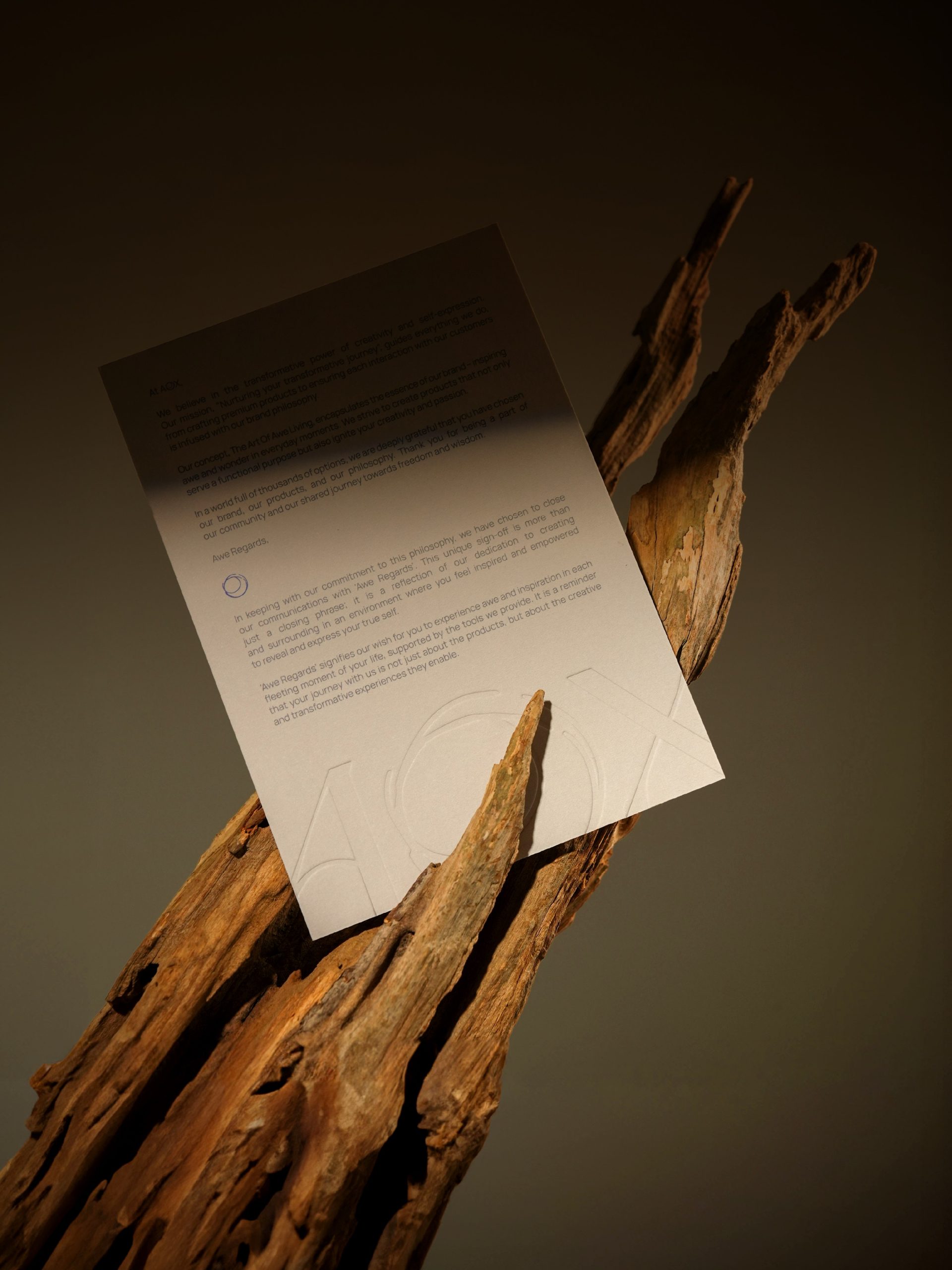
/Bền vững - Sâu sắc - Tự do/
Animorphix, thương hiệu văn phòng phẩm thế hệ mới, được hình thành từ niềm tin rằng mỗi sản phẩm không chỉ là công cụ, mà còn là người bạn đồng hành trong hành trình sáng tạo và khám phá bản thân.
Mỗi thiết kế của Animorphix mang theo hơi thở của thiên nhiên — chứa đựng câu chuyện riêng và những giá trị chân thành. Từ việc chọn lựa chất liệu bền vững như giấy tái chế tuần hoàn, đến sự tỉ mỉ trong từng chi tiết chế tác, thương hiệu luôn hướng tới việc tạo ra những sản phẩm không chỉ đẹp về mặt thẩm mỹ, mà còn khơi dậy cảm hứng để bạn sống tự do, sáng tạo và ý nghĩa hơn mỗi ngày.
——
/Timeless - Spiritual - Empowering/
Animorphix, a new generation stationery company, is built on the belief that each product is not just a tool but also a companion on the journey of creativity and self-discovery.
Each design by Animorphix carries the essence of nature — stories and sincere values. From carefully selecting sustainable materials like recycled paper to meticulously crafting every detail, the brand aims to create products that are not only aesthetically pleasing but also inspire you to live more freely, sincerely, and meaningfully every day.
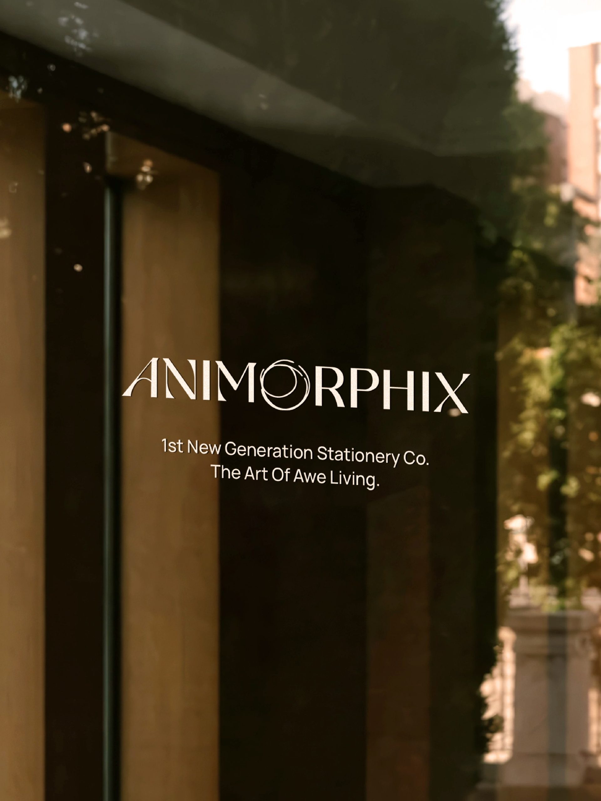
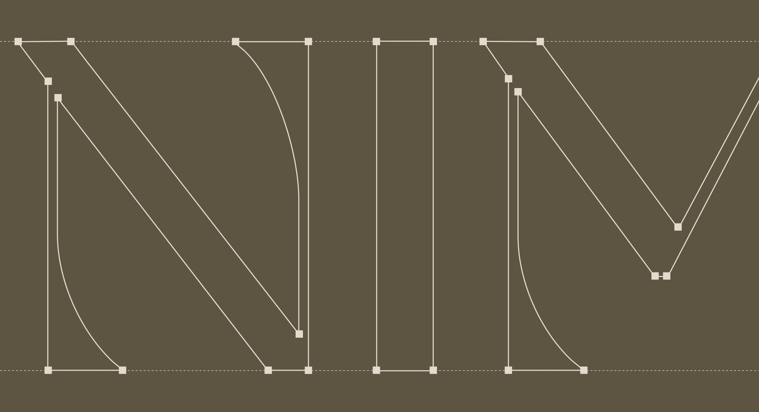
Logo
Logo sử dụng phông chữ có chân với đường nét tương phản rõ rệt, mang đến cảm giác cầu kỳ và sắc sảo. Chữ "A" được xô nhẹ, tạo sự đồng điệu với nét xiên của chữ "X" và kết nối giữa các ký tự. Chữ "O" được cách điệu như nét bút mực viết tay — mềm mại và uyển chuyển, đôi chỗ nhòe nhẹ, gợi cảm giác thủ công tự nhiên. Tổng thể, logo hòa quyện giữa chiều sâu và tinh tế, được điểm xuyết bởi chi tiết phóng khoáng, gợi mở tinh thần sáng tạo.
————
The logo features an uppercase serif typeface with strong contrast in its strokes, evoking a sense of sophistication and refinement. The letter "A" is slightly tilted, echoing the diagonal of the letter "X" and creating a subtle visual harmony between the characters. The letter "O" is stylized to resemble a handwritten ink stroke — soft, flowing, with occasional gentle smudges that suggest a natural, handcrafted feel. Overall, the logo blends depth and elegance, accented by a free-spirited detail that evokes a sense of creativity and artistic freedom.
Color Palette
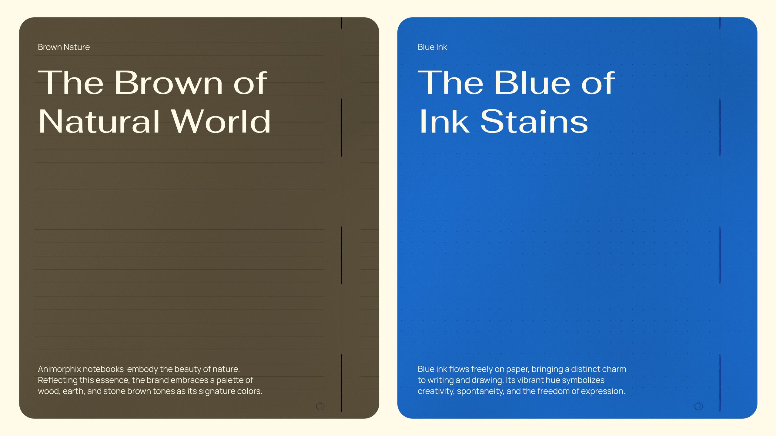
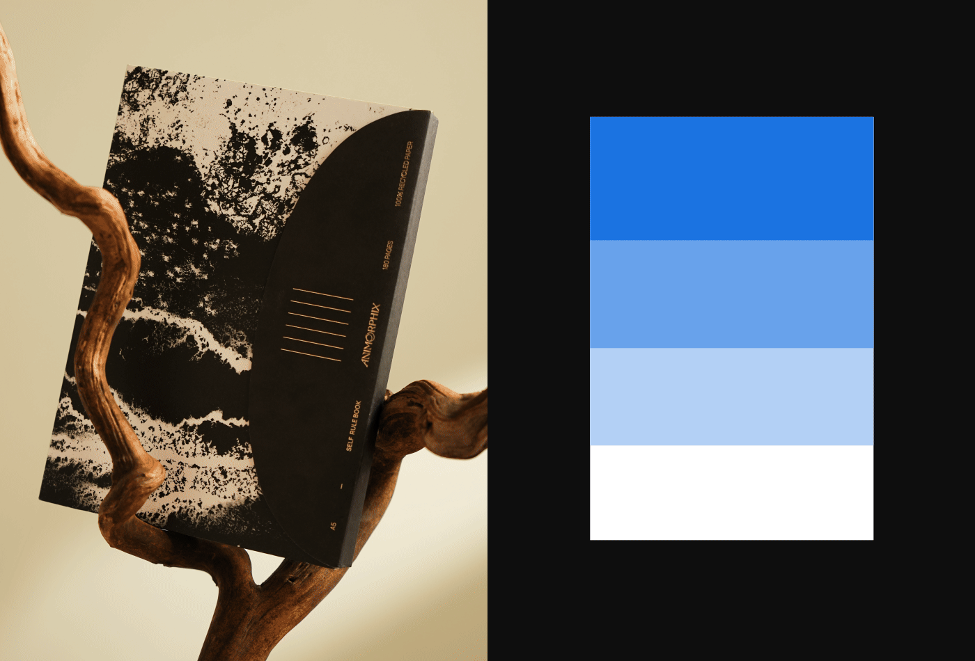
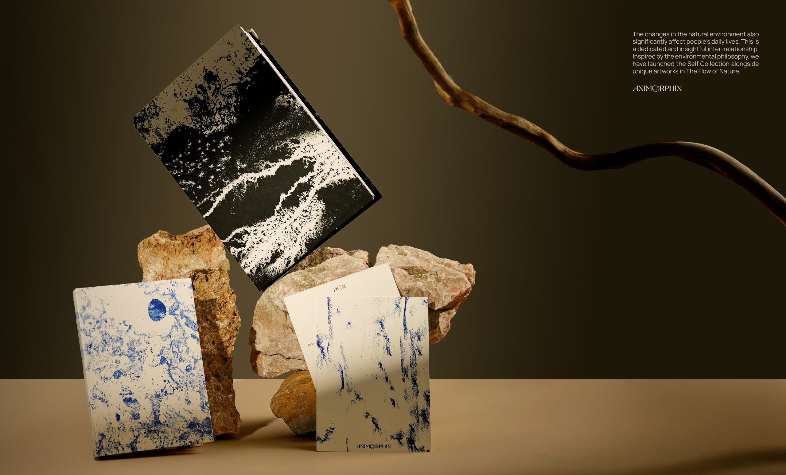
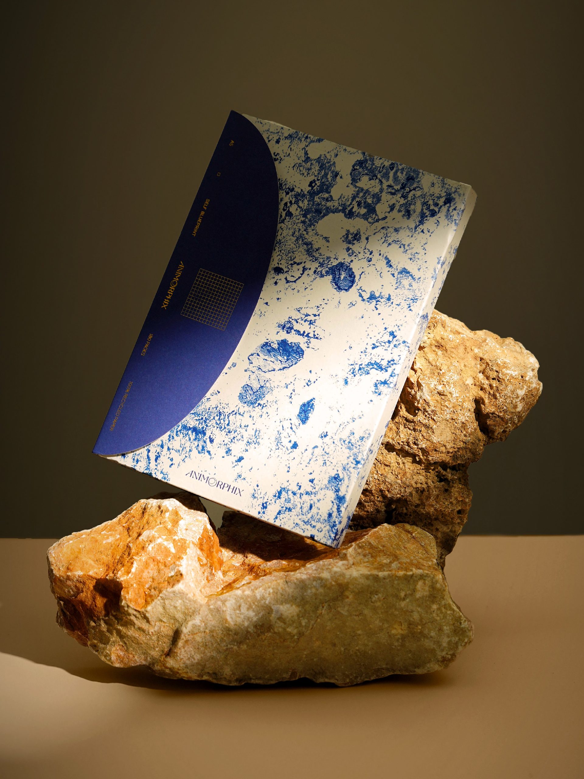
Hệ thống màu sắc lấy cảm hứng từ thiên nhiên — sắc nâu của đất, xám của đá và những gam màu trung tính nhẹ nhàng — phản ánh tinh thần bền vững mà thương hiệu theo đuổi. Điểm nhấn sắc xanh — màu của vết mực loang tự do, gợi mở tinh thần sáng tạo.
————
The color palette draws inspiration from nature — earthy browns, stone greys and soft, neutral tones — reflecting the brand’s commitment to sustainability. A touch of blue, reminiscent of freely ink, adds a creative accent and evokes a spirit of imagination and artistic freedom.
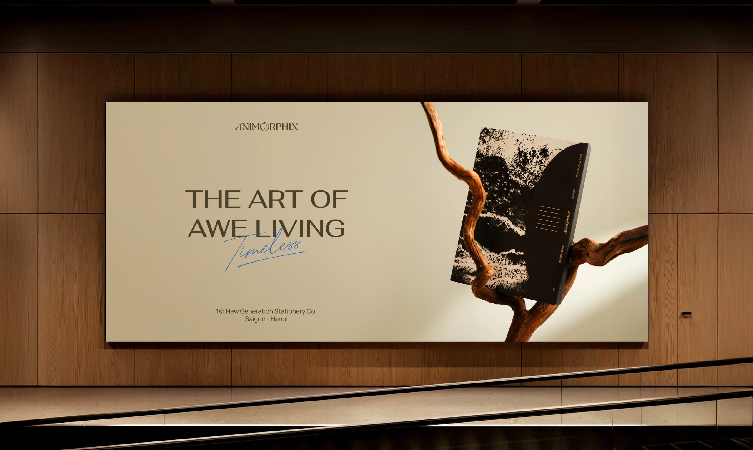
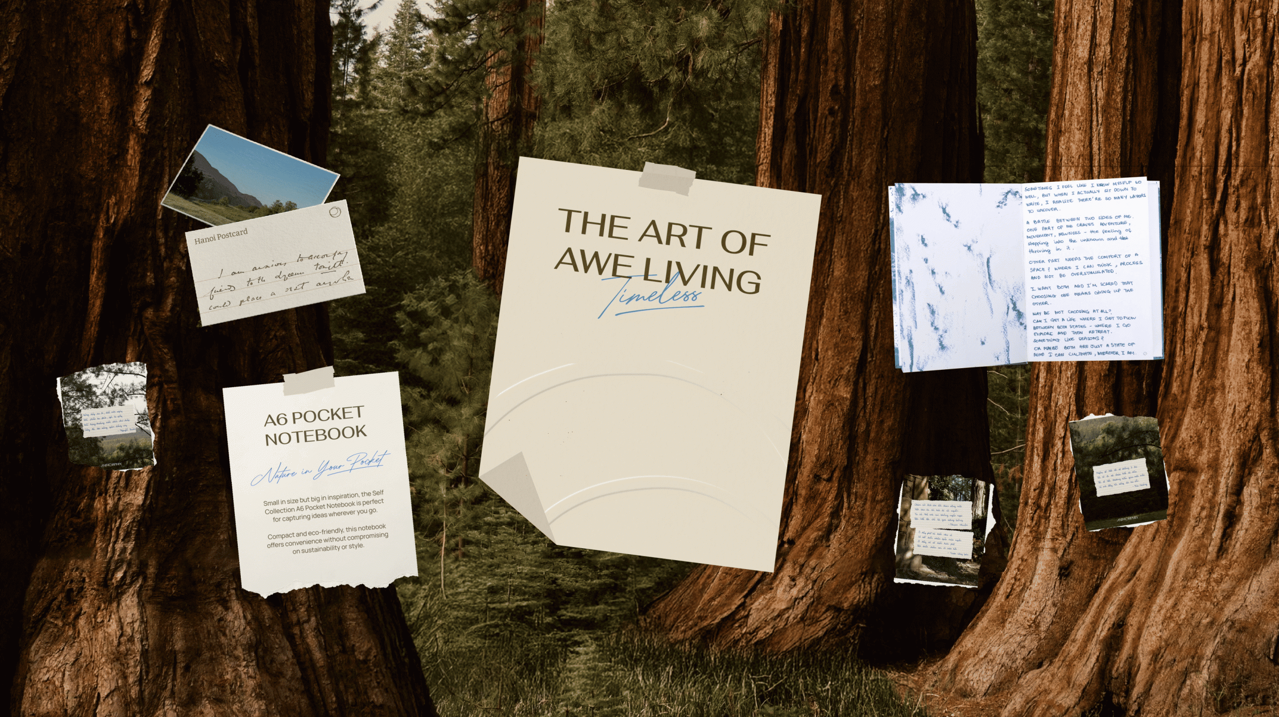
Visual Identity
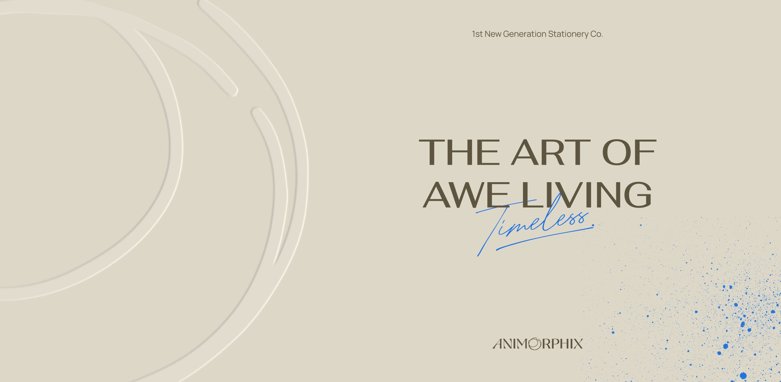
Với triết lý "The Art of Awe Living", ngôn ngữ thiết kế của Animorphix hướng tới vẻ đẹp của sự tối giản — nơi bạn có thể loại bỏ những điều không cần thiết, dành trọn sự tập trung để kết nối sâu sắc hơn với chính mình và thế giới xung quanh.
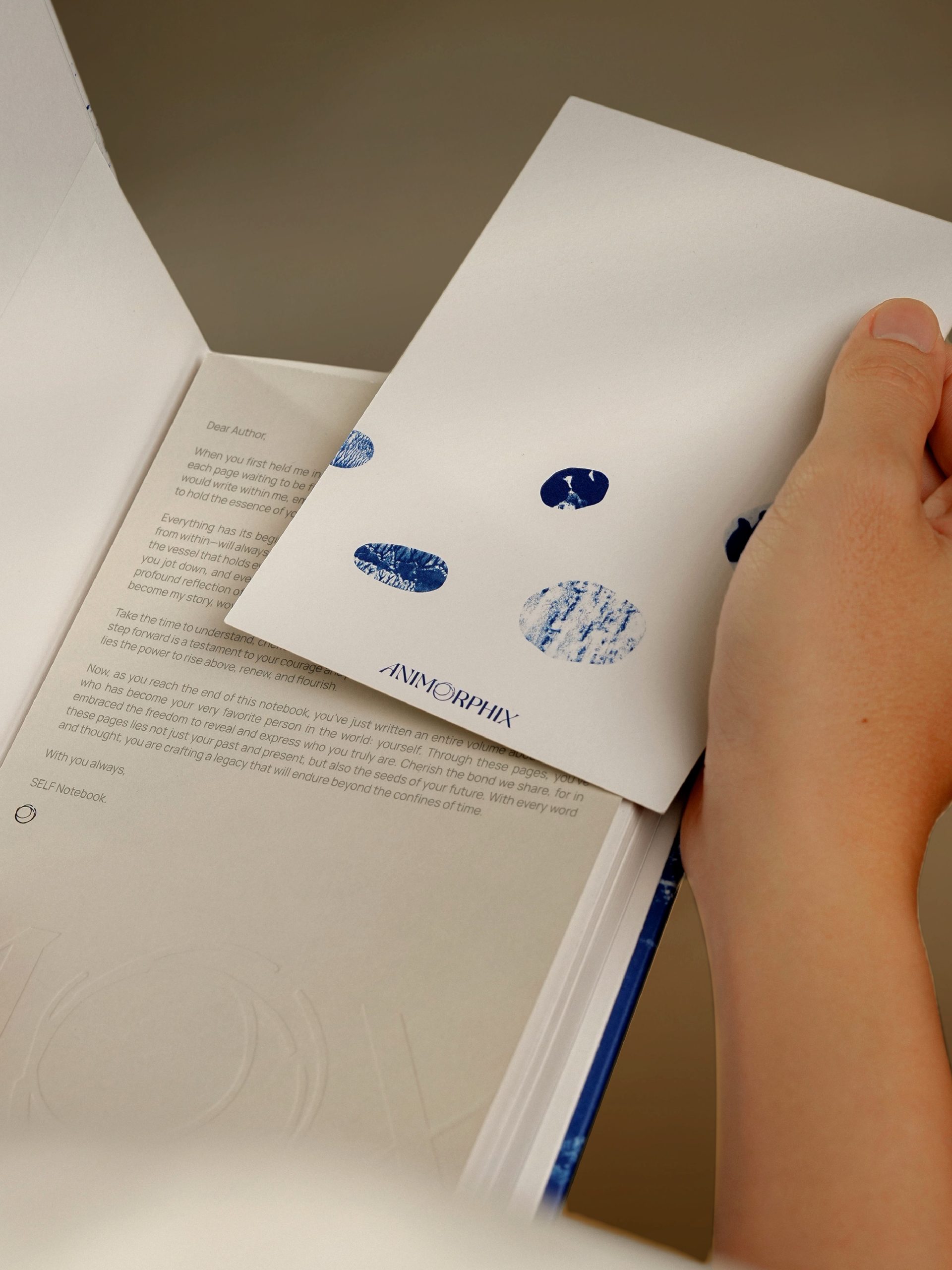
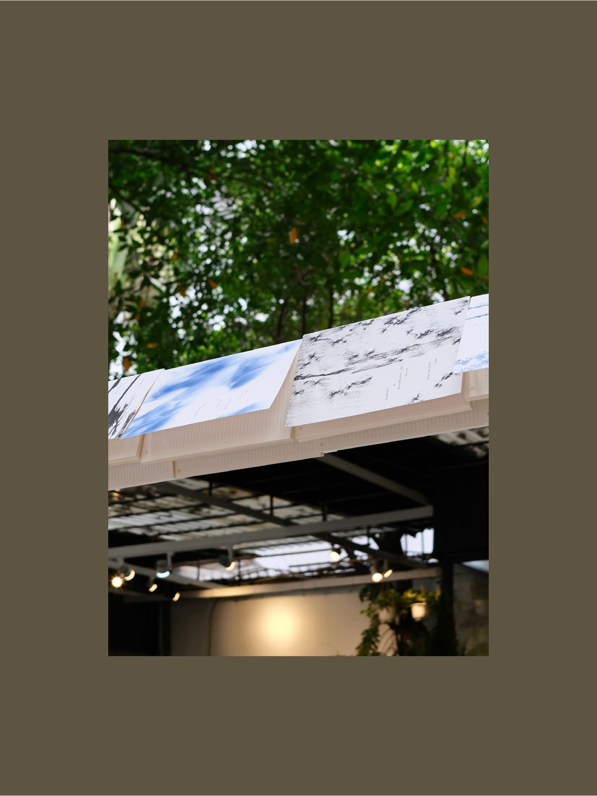
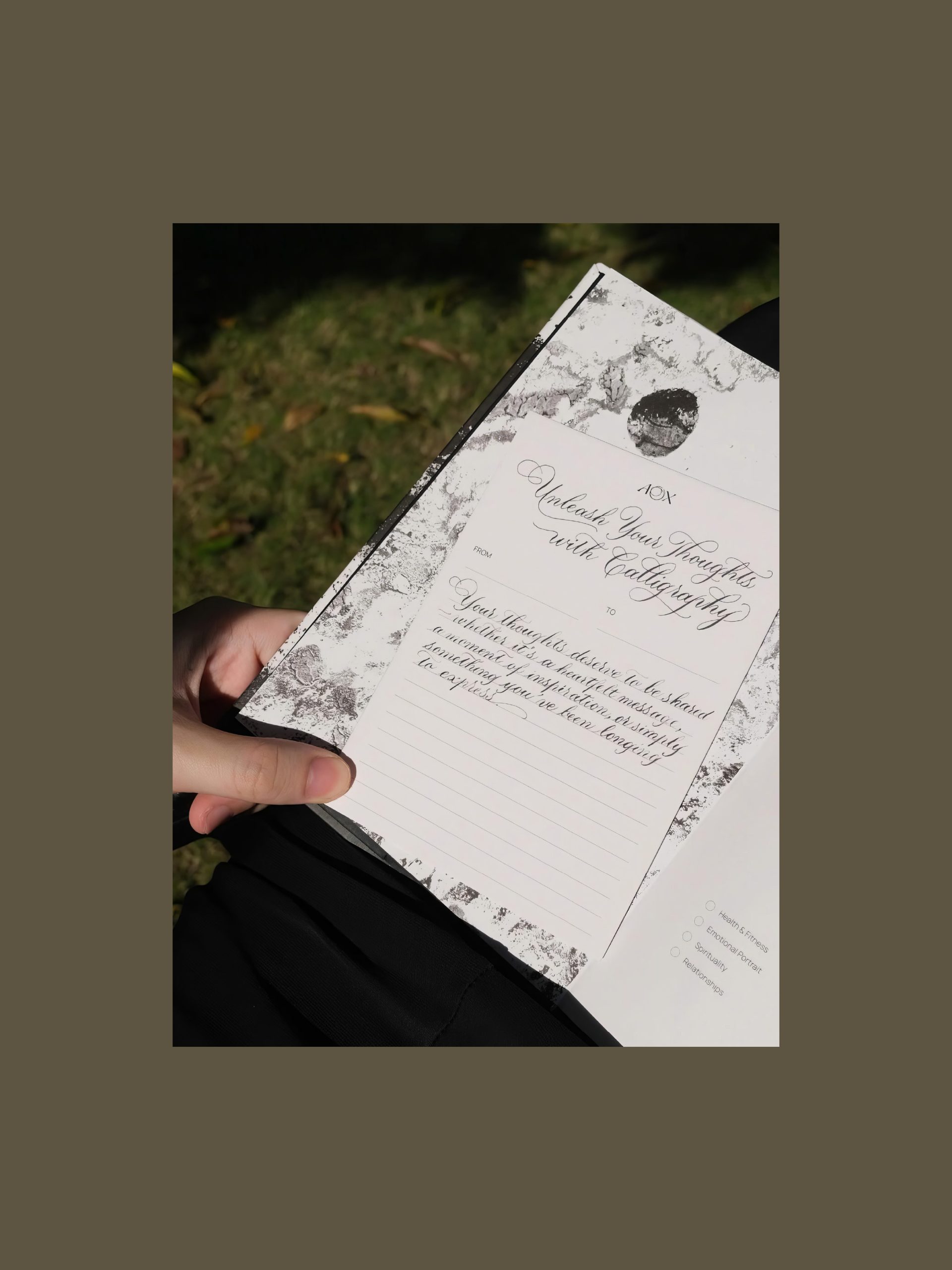
Hệ thống font chữ được lựa chọn kỹ lưỡng: thanh lịch, sâu sắc, và nhấn nhá bởi chữ viết tay mang sắc mực xanh gần gũi. Các yếu tố đồ họa gợi nhắc đến vẻ đẹp nguyên bản của tự nhiên — mộc mạc, thô ráp, với chất liệu giấy sần nhẹ, những vệt mực loang ngẫu hứng. Layout tinh giản, chuẩn mực, truyền tải thông điệp sâu sắc về cuộc sống.
————
With the philosophy "The Art of Awe Living", Animorphix's design language embraces the beauty of minimalism — a space where you can eliminate the unnecessary and fully focus on connecting more deeply with yourself and the world around you.
The typography is carefully chosen: elegant, profound, and accented with handwritten strokes in a shade of ink blue. The graphics evoke the raw beauty of nature — simple, rugged, with lightly textured paper and spontaneous ink smudges. The minimalist layout, with its refined proportions, conveys a profound message about life.
Digital Experience
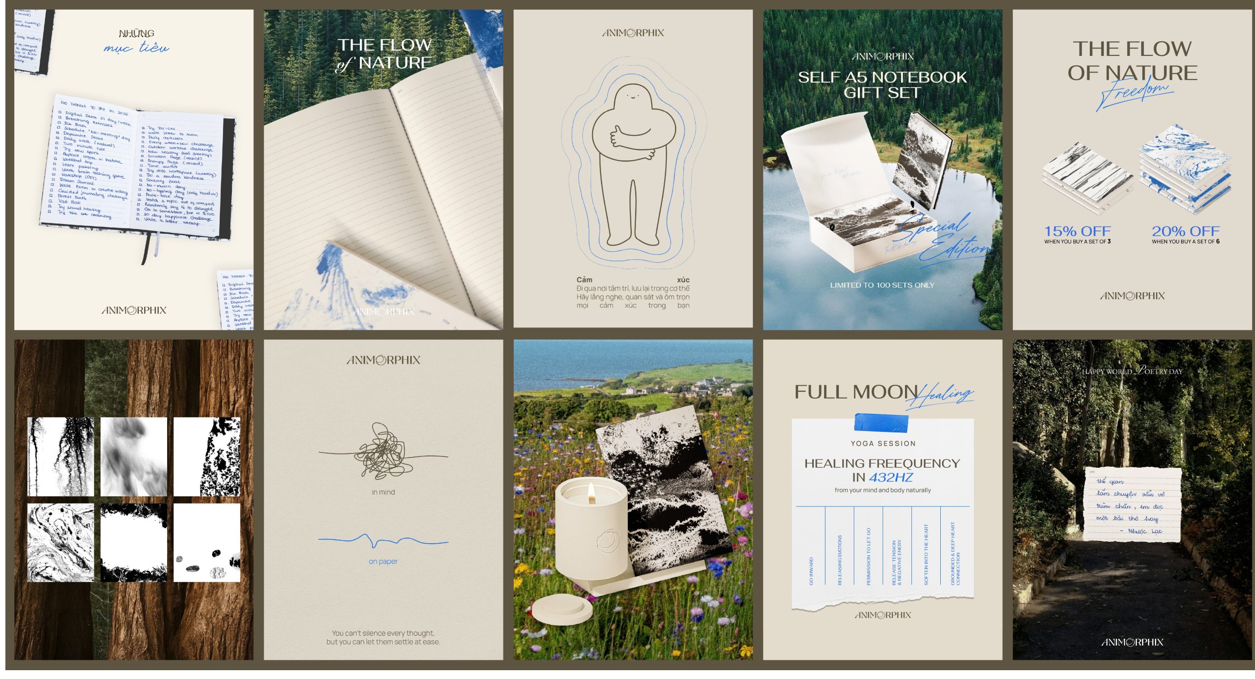
Website concept của Animorphix được thiết kế với mục tiêu mang đến trải nghiệm trực quan cho người dùng, đồng thời phản ánh trọn vẹn ngôn ngữ thiết kế của thương hiệu. Các điểm chạm kỹ thuật số khác như bài đăng trên mạng xã hội cũng chú trọng truyền tải sự tinh tế và chuẩn mực mà thương hiệu hướng tới.
————
The website concept of Animorphix is designed to deliver an intuitive user experience while fully reflecting the brand’s design system. Other digital touchpoints, such as social media posts, are also carefully crafted to reflect the refinement and sophistication the brand aspires to convey.
Brand Experience
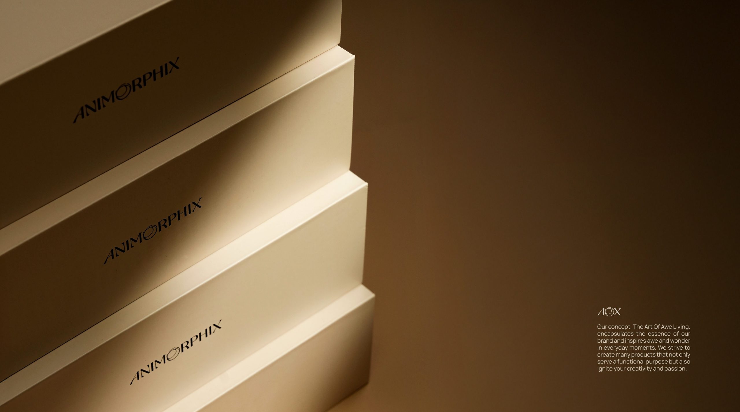
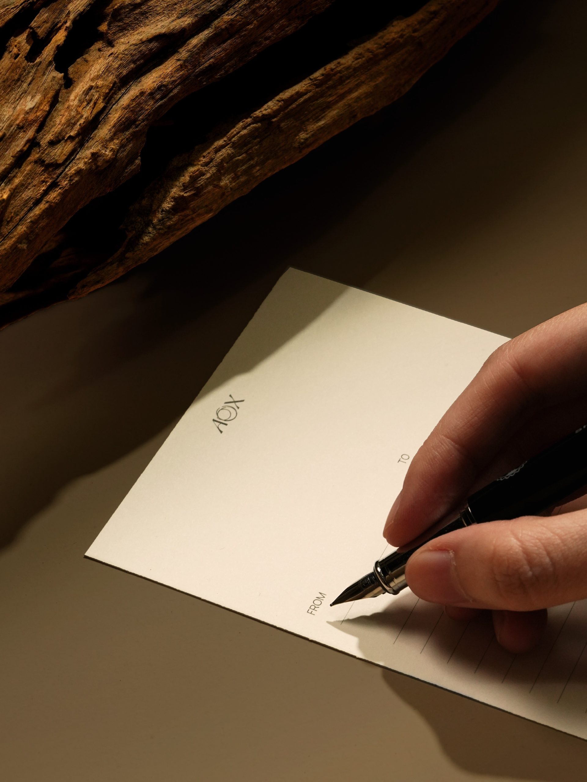
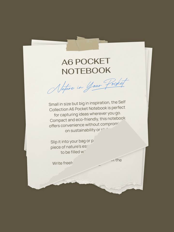
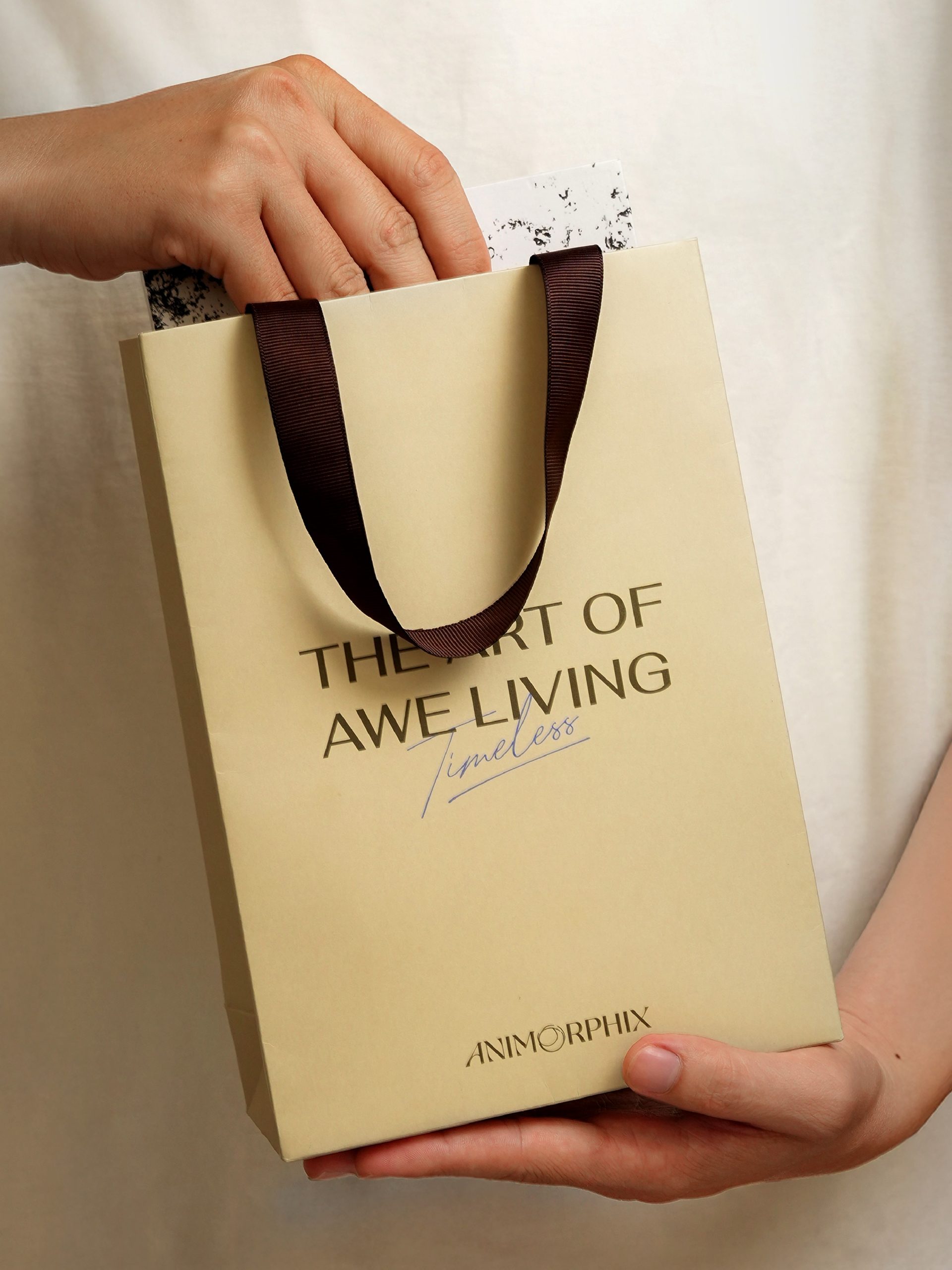
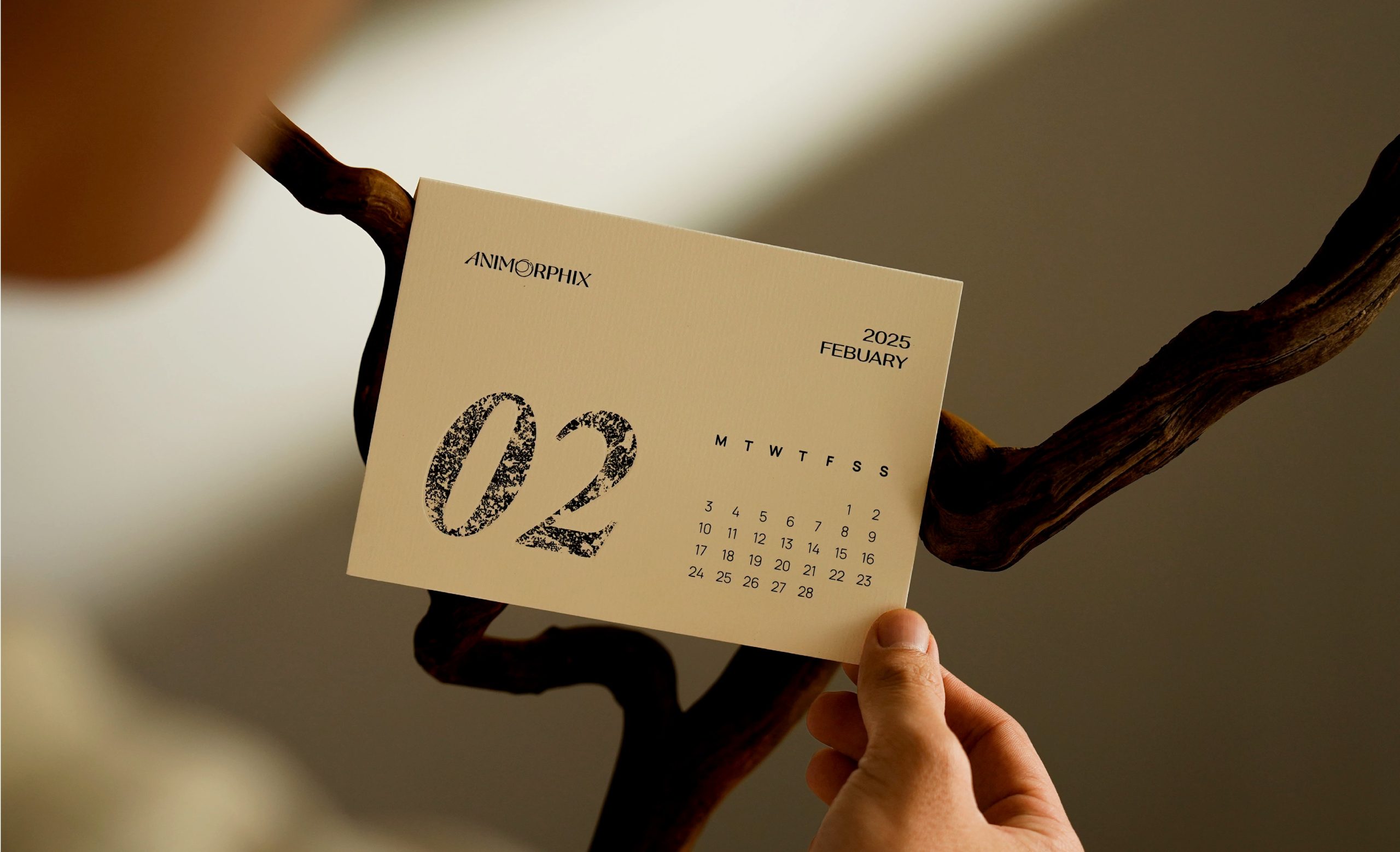
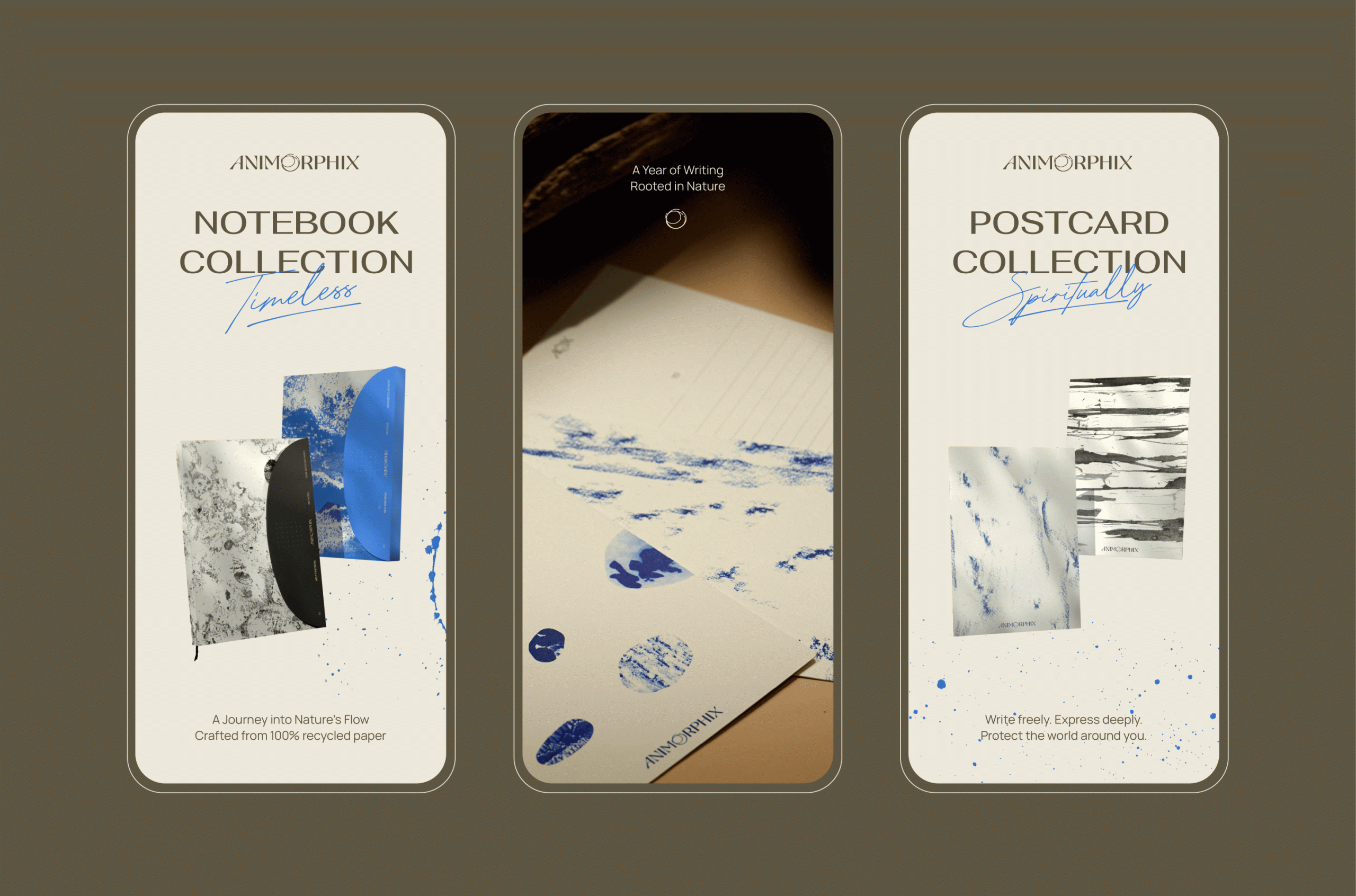
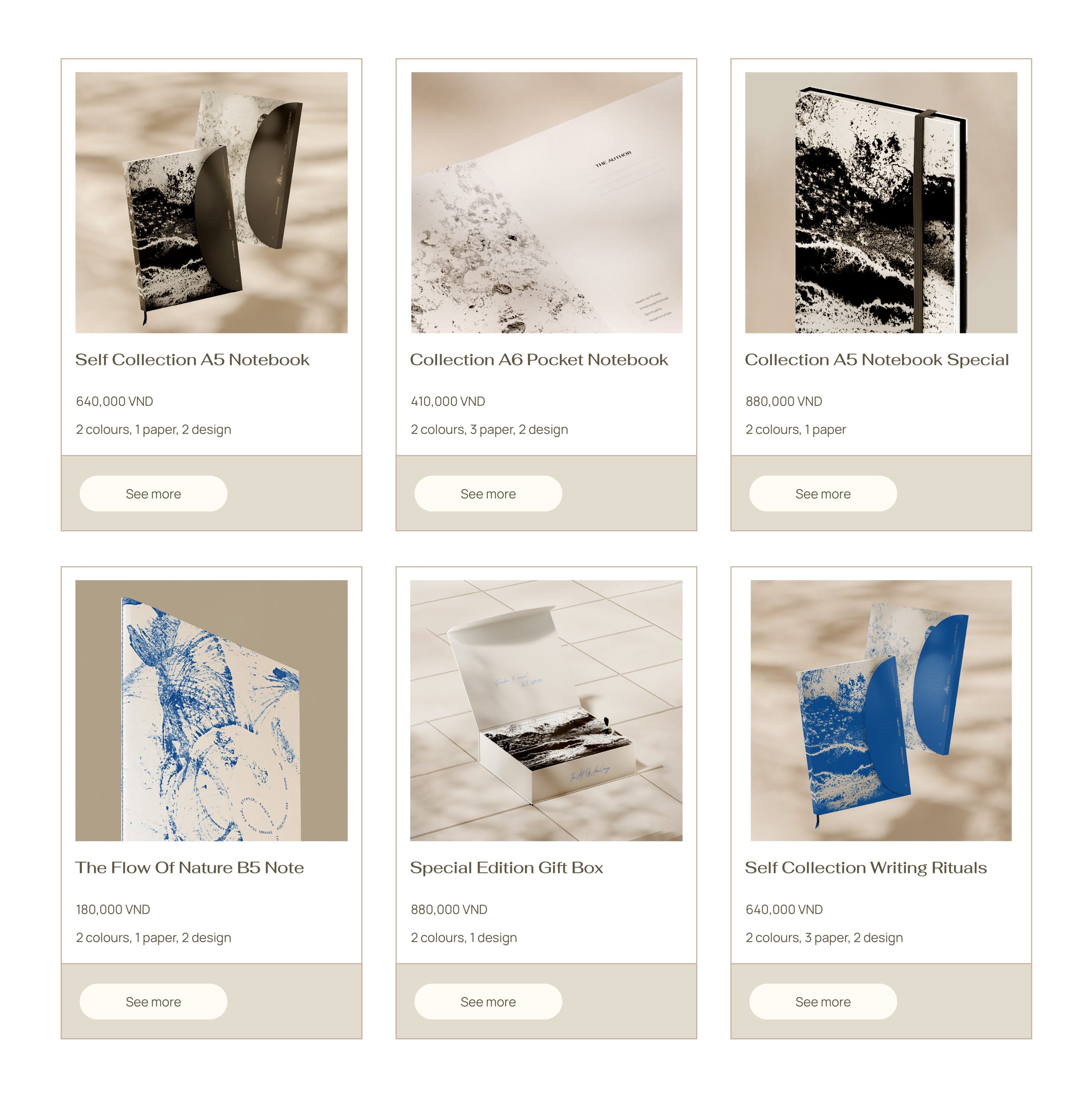
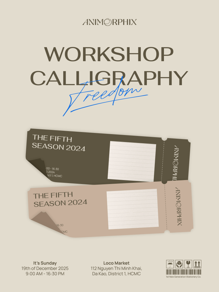
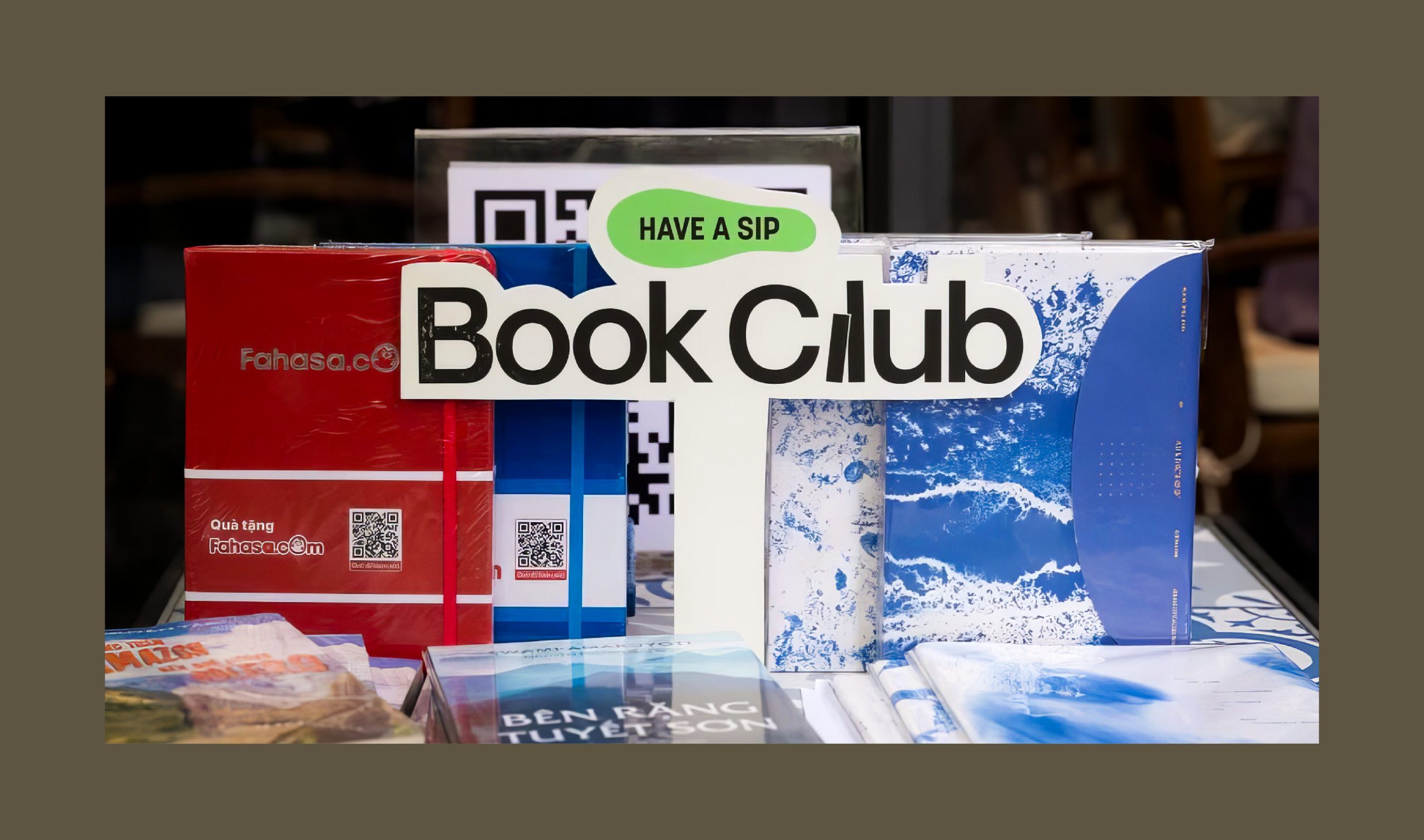
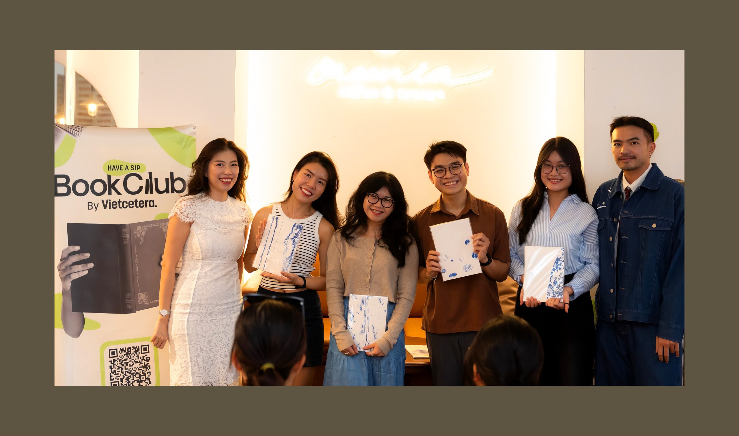
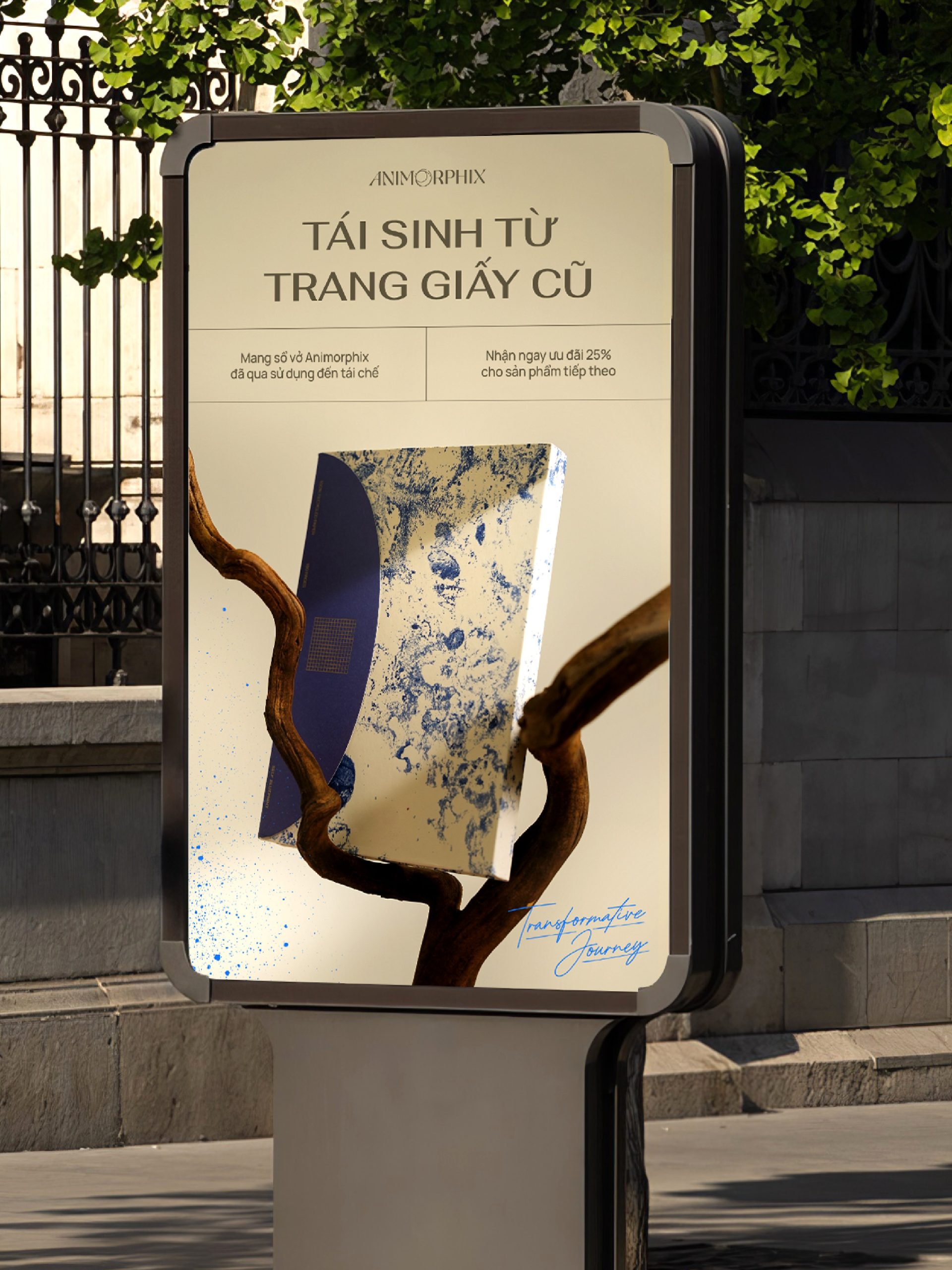
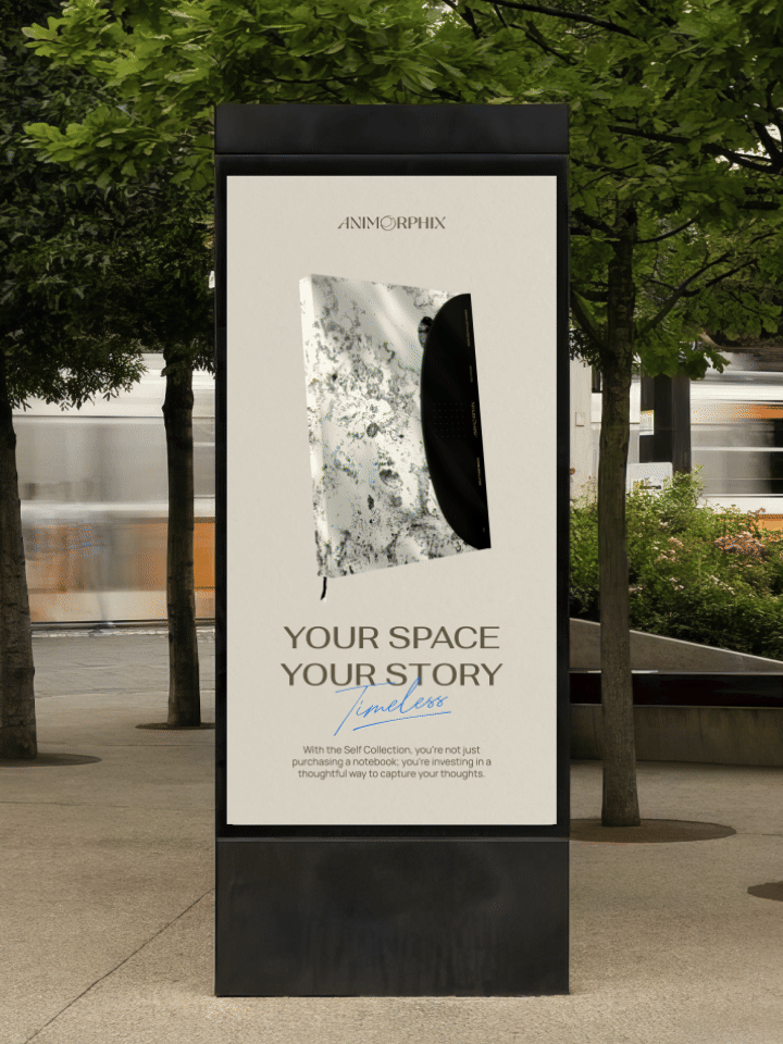
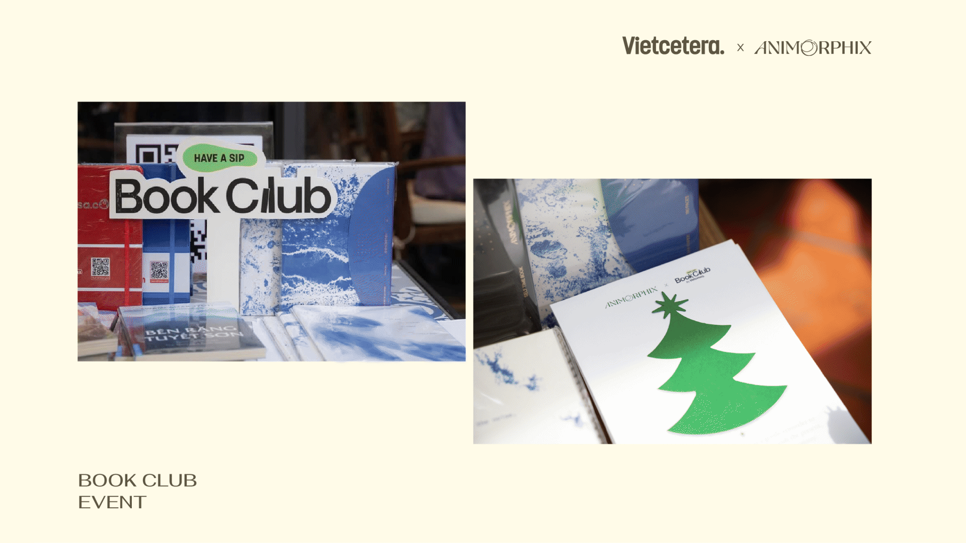
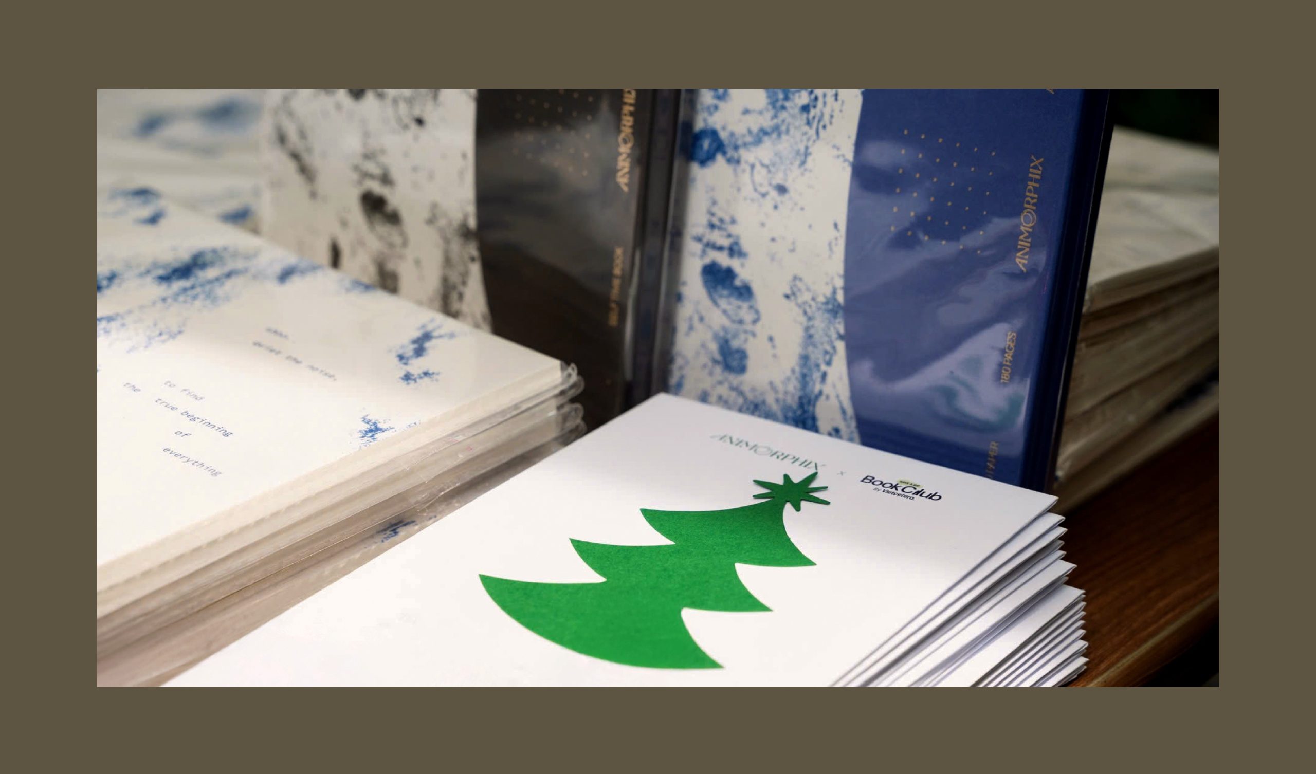
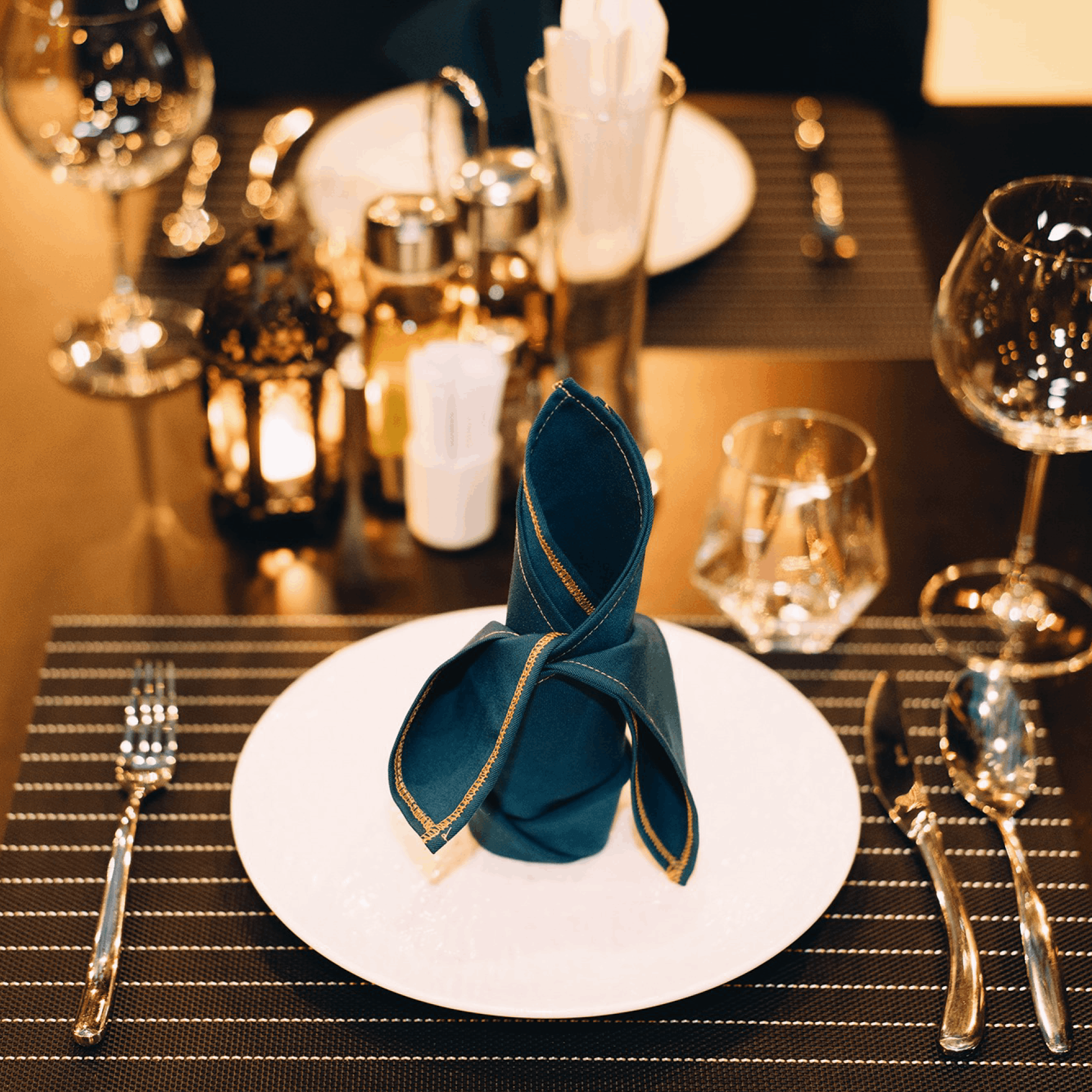
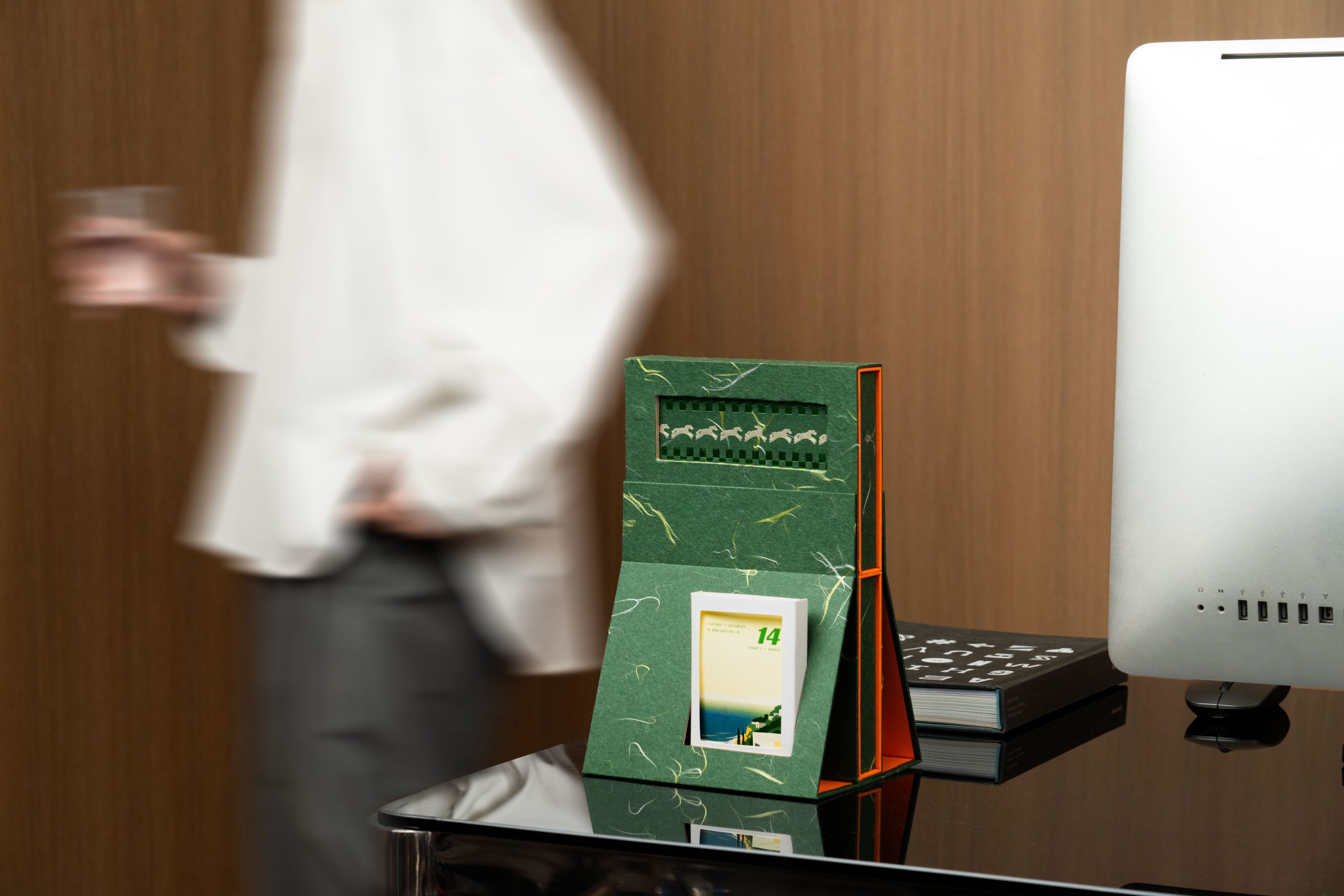
Đội ngũ Animorphix đã ứng dụng rất tốt ngôn ngữ thiết kế của thương hiệu vào các điểm chạm thực tế, từ những trải nghiệm vật lý như sổ tay, pop-up store, workshop,... đến các nền tảng kỹ thuật số như bài đăng trên mạng xã hội, website, và hình chụp sản phẩm,... Mỗi điểm chạm đều phản ánh một cách chỉn chu và nhất quán cá tính thương hiệu.
————
The Animorphix team has successfully applied the brand's design language across various touchpoints, from physical experiences such as notebooks, pop-up stores, and workshops,... to digital platforms like social media posts, the website, and product photography,... Each touchpoint reflects the brand's personality in a refined and consistent manner.
Credit
————
Client: ANIMORPHIX
Branding Agency: Cillgold
Creative Director: Liêm Ng.
Creative Designer: Nhi Bui
Photography: Chí Cường, Nhi Bui, Hồ Khoa
Website Concept: Tam Chu
Design & Print Production: Navigator Studio
————
Thanks for watching.
If you like our project, please appreciate below.
Follow us: Facebook | Instagram |


Bình luận